
Aligning Design with Identity: Transforming Le Marche’s Online Experience
Le Marchè is a premium greengrocer renowned for supplying the finest fresh produce to London’s most prestigious restaurants and hotels. Trusted by more Michelin-starred establishments than any competitor, Le Marchè has earned its reputation through unwavering quality and exceptional service.
Exclusivity lies at the heart of their ethos. By intentionally limiting the number of clients they serve, Le Marchè ensures its standards remain uncompromised, fostering close, personalised relationships with each establishment. This dedication to excellence has led to such high demand that a waiting list of elite establishments now eagerly awaits the opportunity to join their clientele. For Le Marchè, exclusivity is not just a byproduct of success—it is a principle they passionately uphold.
What truly sets Le Marchè apart is their unique dual presence in Covent Garden Market, London, and Rungis Market, Paris. With dedicated buyers and a fleet of vans transporting the very best produce from Paris to London, they bring unmatched quality and freshness straight to their clients’ kitchens.
My Role
UX UI Design lead
Timeline
3 Weeks
Core Activities
Business Review and Lean UX Canvas
Google Analytics review
Competitor Analysis
Low Fidelity Wireframes
High Fidelity Wireframes
Prototype
Le Marche’s current website was originally designed with an editorial feel, which served its purpose at the time. As the brand continues to grow, the owner now seeks to align the site more closely with its identity and ethos while preserving much of its existing content. I was brought in to evolve the design and user experience, refining the site to better reflect the brand’s premium, exclusive nature and ensure a seamless connection with its core values—while maintaining its strong and informative content.
Background
The aim is to redesign Le Marché’s website to reflect its premium and exclusive brand identity, addressing its current lack of sophistication and low user engagement. The new design should also help filter out unsuitable enquiries—often driven by Instagram—that overwhelm the team. Additionally, the redesign must enhance the "100 Club", transforming it into a valuable resource for chefs by providing tailored information and exclusive perks that reinforce the brand’s prestige and quality. As the website is managed on Squarespace, the UI design must be optimised to work seamlessly within the platform’s capabilities.
The challenge
I used a Lean UX Canvas to focus on user needs and business goals, ensuring solutions were clear, actionable, and validated through research. This approach streamlined decisions and aligned the project with Le Marchè’s objectives.
Business Review
As outlined in the Lean UX Canvas, the fastest way to test my hypothesis—that professional chefs would use an interactive seasonality calendar—was to utilise Le Marchè’s large Instagram following. I created a poll on their Story, incorporating imagery of their owner, Marcus, who is well-recognised by their 80k+ followers, to boost engagement. To make the poll more engaging and visually appealing, I also included emojis.
The results validated my hypothesis, with 67% of respondents answering "yes."
Testing My Hypotheses


To highlight the key elements that set Le Marchè apart from competitors, the user flow required adjustments to ensure the following points were communicated effectively:
Premium greengrocer
Dual locations in Paris and London
Established in 1770
Supplier to London’s finest establishments
The navigation previously included too many pages, which, while informative, diluted the focus. I streamlined the structure by consolidating and prioritising pages to ensure the most critical information was easily accessible.
Additionally, the homepage was identified as an ideal space to use bold, impactful statements to reinforce Le Marchè’s unique identity and key selling points.
Prioritising Key Information
Google Analytics Review: Understanding User Engagement

I conducted an analysis of Google Analytics to assess user engagement with the current website. This enabled me to identify which areas of the site are performing well and which require improvement, removal, or modification. Additionally, it provided insights into the devices being used to view the website. Below are the key findings from my analysis.
Key Findings:
Low Return Users: Only 0.5% of users are returning visitors, indicating a need to improve engagement and retention strategies.
Average Engagement Time: The average engagement time per user is low at just 39.1 seconds, suggesting that visitors are not spending much time exploring the site.
Page Views in Order of Popularity:
Home Page (10 sec): Quick visits suggest the page may not immediately capture attention. Adding more engaging content, such as videos, could help improve this.
Suppliers (18 sec): Short engagement suggests low interest. Consider adding videos featuring the owner and suppliers to improve engagement.
Contact (32 sec): The longer time suggests users are considering reaching out. To reduce time-wasting enquiries, the contact form should indicate that it's primarily for trade customers.
100 Club (21 sec): Moderate interest. This shows that users are intrigued by the 100 Club. Adding more value, such as an interactive seasonality calendar, could further engage users and reinforce Le Marchè as a resource for chefs.
London & Paris (27 sec): Users are spending more time here, showing interest in the origins of the produce. This page is key in promoting Le Marchè's unique selling point of its dual presence in London and Paris.
Meet the Team (1 min 1 sec): High engagement time indicates a demand for more information about the team. This page could be expanded into an "About Us" section, where visitors can learn more about the company as well as the staff.
Market Report (28 sec): Users likely scan for key points. Breaking down the content into digestible sections with visuals or summaries would help improve engagement.
Stories from The 100 Club (50 sec): Good engagement. Expanding this section with videos or additional related content could further enhance user interest.
History (53 sec): Strong interest in historical content. This page could be grouped within the "About Us" section to reduce clutter in the top navigation.
100 Club Members Area (1 min 11 sec): The long time spent here suggests deep engagement, indicating that users find value in this section. It's important to keep the content engaging, as there appears to be demand for it.
Devices Users Are Using:
82% of users access the site via mobile
17% via desktop
1% via tablet
This highlights the importance of ensuring the website is optimised for mobile, as the vast majority of users are accessing it on mobile devices.
Competitor Analysis


Le Marché operates in a competitive market with the main competitors include Wellocks, Smith & Brock, and Nature’s Choice. I analysed to see how Le Marche can differentiate itself. Below is a summary.
Wellocks
Strengths:
Strong reputation for supplying Michelin-starred restaurants.
Clear "Perfect Ingredients" positioning, emphasising consistency and quality.
Well-structured website with clear customer pathways and case studies.
Weaknesses:
Feels corporate and less personal, lacking a strong story or exclusivity beyond Michelin credentials.
No online ordering system, making procurement less convenient.
Opportunity for Le Marché:
Stand out by offering a more bespoke, concierge-style service, giving chefs access to unique, hard-to-source ingredients from Covent Garden & Rungis.
Smith & Brock
Strengths:
Strong family-owned brand identity, which adds a personal touch.
Good wholesale offering with a focus on quality and service.
Weaknesses:
Limited differentiation—blends in with standard premium greengrocers.
Website lacks a strong call to action and online ordering function.
Opportunity for Le Marché:
Emphasise exclusivity and international reach (Covent Garden & Rungis) to differentiate from Smith & Brock’s more localised approach.
Develop a stronger online presence and ordering system to improve accessibility for trade customers.
Nature’s Choice
Strengths:
Well-established wholesale business with strong market knowledge.
Direct, no-frills approach appeals to trade buyers.
Weaknesses:
Lacks premium branding—feels more functional than high-end.
Website and marketing are outdated compared to premium competitors.
No clear unique selling point beyond being a wholesale supplier.
Opportunity for Le Marché:
Position itself as the luxury alternative to traditional wholesale, offering higher-end, exclusive produce with a premium customer experience.
Use high-end branding, storytelling, and Michelin-starred partnerships to appeal to top-tier clients.
Key Insights from Competitor Research
With insights gained from competitor research, I developed a strategic plan to differentiate Le Marché’s website from its competitors. The goal is to highlight Le Marché’s strengths while addressing key business challenges.
To stand out as the luxury alternative to traditional wholesale, Le Marché must enhance branding, storytelling, and trade-only accessibility while differentiating from Nature’s Choice, Smith & Brock, and Wellocks.
Luxury Brand Identity
Use premium design, typography, and colour palette to create a high-end feel.
Highlight Michelin-starred partnerships and international sourcing (Covent Garden & Rungis)
Stronger Storytelling & Trust
Showcase chef testimonials, case studies, and supplier partnerships to reinforce credibility.
Feature behind-the-scenes market insights to add exclusivity and differentiate from Wellocks’ corporate tone.
Premium Customer Experience
Develop a sleek, modern website tailored to high-end hospitality clients.
Improve navigation with trade-only pathways, avoiding Nature’s Choice’s outdated, functional design.
Exclusive Product Display
Feature rare, seasonal, and premium ingredients with high-quality imagery.
Label key products as “Limited Availability” to drive demand and differentiation.
Seamless Trade Ordering
Implement a trade-only online ordering system for busy chefs.
Homepage Design: Establishing Le Marché as a Premium Supplier
The homepage should immediately position Le Marché as a high-end, trusted supplier, setting the tone for an exclusive experience.
Hero Section: Showcase Le Marché’s unique selling points through immersive visuals. Use high-quality videos of fresh produce with compelling statements, such as:
"Premium Greengrocer" (above the fold)
"Delivering the Very Best from Paris & London"
"Established 1770"
Trust Signals: Reinforce credibility with images of the owner alongside renowned Michelin-starred chefs, supported by testimonials.
Extended Scroll: Incorporate a longer scroll format to emphasise Le Marché’s expertise. Feature links to past accolades, press mentions, and charitable initiatives to further build trust and authenticity.
Low Fidelity Wireframes


High Fidelity Wireframes
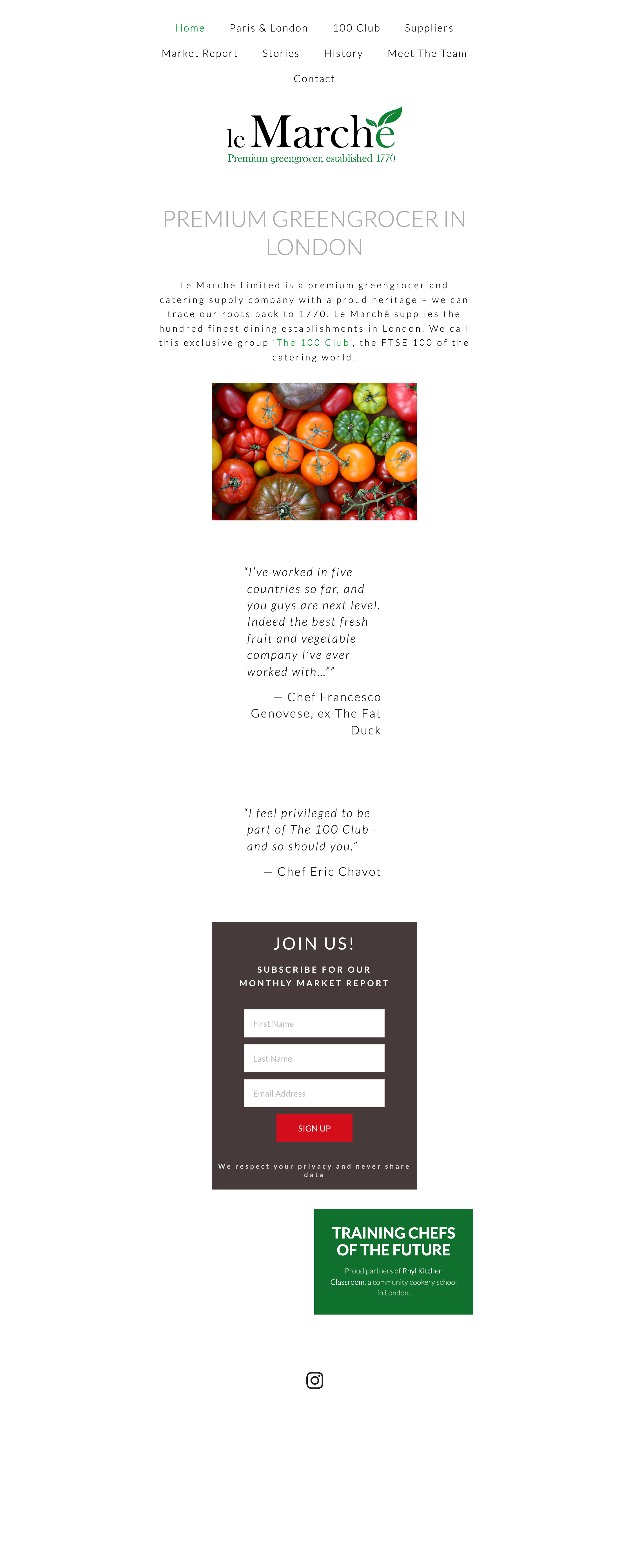
Home - Before
Home - After
Full-screen videos showcasing premium produce, paired with key statements that highlight Le Marché’s unique positioning, set them apart from competitors. Combined with parallax scrolling text, these elements create a captivating and impactful first impression of the company.
Simplified navigation.


London & Paris - After

100 Club, Seasonality Calendar - After

Contact Us - After
Prototype
What did I learn from this UX UI project?
During this project, I learnt the importance of designing an interface that works within the constraints of a platform—in this case, Squarespace—while ensuring both functionality and a seamless user experience. I also enjoyed collaborating with the developer and the team at Le Marché, gaining a deeper understanding of the business, which helped us overcome key challenges and create a more effective solution.